COVID case/death and vaccine
library(tidyverse)
library(lubridate)
library(broom)
library(knitr)

knitr::opts_chunk$set(echo = TRUE)
While we look into the cases and mortality in the US and New York State, We also have a fascination of tracking the course of this pandemic. Do we actually have power over this black swan event?
Tracking the Course of the COVID Pandemic
By using NY Times COVID tracking data from the very beginning of COVID onset, we firstly refresh what has happened and what has changed.
us_states_long = read_csv("./us_states_long.csv")

us_states =
  us_states_long %>%
  filter(date > as.Date("2020-03-01")) %>%
  pivot_wider(names_from = "data_type",
              values_from = "value") %>%
  rename(state = location) %>%
  select(date, state, cases_total, deaths_total) %>%
  mutate(state = as_factor(state)) %>%
  arrange(state, date) %>%
  group_by(state) %>%
  mutate(
    cases_7day = (cases_total - lag(cases_total, 7)) / 7,
    deaths_7day = (deaths_total - lag(deaths_total, 7)) / 7)

us <- us_states %>%
  group_by(date) %>%
  summarize(across(
    .cols = where(is.double),
    .fns = function(x) sum(x, na.rm = T),
    .names = "{col}"
  ))

us[10:20, ] %>%
knitr::kable()| date | cases_total | deaths_total | cases_7day | deaths_7day |
|---|---|---|---|---|
| 2020-03-11 | 1263 | 37 | 130.0000 | 3.428571 |
| 2020-03-12 | 1668 | 43 | 178.8571 | 4.142857 |
| 2020-03-13 | 2224 | 50 | 243.2857 | 4.714286 |
| 2020-03-14 | 2898 | 60 | 317.0000 | 5.571429 |
| 2020-03-15 | 3600 | 68 | 391.5714 | 6.142857 |
| 2020-03-16 | 4507 | 91 | 507.0000 | 9.142857 |
| 2020-03-17 | 5906 | 117 | 668.7143 | 12.285714 |
| 2020-03-18 | 8350 | 162 | 991.8571 | 17.857143 |
| 2020-03-19 | 12393 | 212 | 1511.2857 | 24.142857 |
| 2020-03-20 | 18012 | 277 | 2251.4286 | 32.428571 |
| 2020-03-21 | 24528 | 360 | 3086.1429 | 42.857143 |
Through a glance of the table, we aggregate the cases and deaths in the unit of 7-day for national level. Now we are wondering what is the relationship between positive cases and deaths? How has it varied as the pandemic has progressed in time? Through a line graph showing trends in cases and deaths in the U.S, we are able to tentatively examine and hypothesize the correlation between the weekly cases and deaths.
coeff <- 20
# Since deaths_7day is too small to plot at the same time with cases, we add a random number to make deaths_7day more visible, "10" is not work so well, ~30 seems more suitable

us %>%
  ggplot(aes(date, cases_7day)) +
  geom_line(color = "orange") +
  theme(legend.position = "none") +
  geom_line(aes(x = date, y = deaths_7day * coeff), color = "red") +
  scale_y_continuous(
    labels = scales::comma,
    name = "Cases",
    sec.axis = sec_axis(deaths_7day ~ . / coeff,
      name = "Deaths",
      labels = scales::comma
    )
  ) +
  theme(
    axis.title.y = element_text(color = "orange", size = 13),
    axis.title.y.right = element_text(color = "red", size = 13)
  ) +
  labs(
    title = "U.S. Cases vs. Deaths",
    subtitle = "7-Day Average",
    caption = "Source: NY Times, Arthur Steinmetz",
    x = "Date"
  )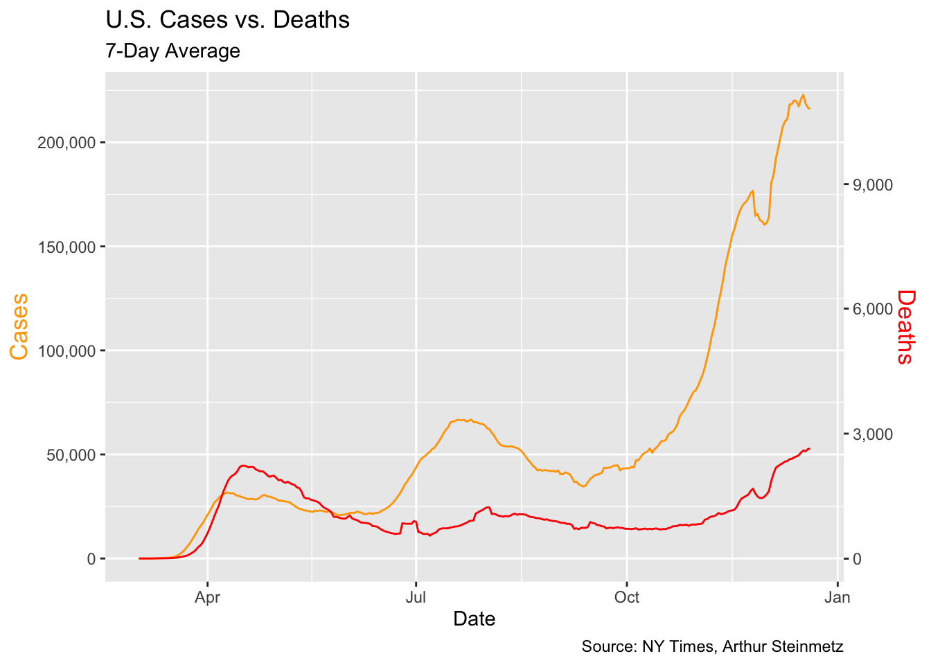
While the line graph shows that the more cases, the less deaths in general trend, it is apprently not a reasonable relationship to conclude. Rather, we would hypothesize that the declining mortality rate as we have come to better tactics handling COVID. Thus, we turn to a simple linear regression to prove our thoughts on whether the relationship between cases and deaths is highly conditioned on date.
Relationship Between Cases and Deaths
lm_df =
  lm(deaths_7day ~ cases_7day + date, data = us) %>%
  broom::tidy()
As predictors both have significant p-value, “date” weights more than “cases_7day” in predicting the deaths_7day. Therefore, the death versus cases would be more efficient to show a correlation if it is adjusted by time series or lead-lag analysis. Overall, the death rate has lowered as well as the positive cases has slowed down its aggressiveness in terms of exponential growth but how did this happen? Can we ascribe this to the accessibility of vaccine?
Modeling the Effectiveness of Vaccination
By taking calculated incidence rates from CDC in 2021, which suggests cases among persons who were not fully vaccinated compared with those among fully vaccinated persons decreased from 11.1 to 4.6, we, thus, try to model a hypothesized comparison for cases from the onset of pandemic and see how that might bend when the very first vaccine is available on 12.14, 2020.
CDC Reference: Scobie HM, Johnson AG, Suthar AB, et al. Monitoring Incidence of COVID-19 Cases, Hospitalizations, and Deaths, by Vaccination Status — 13 U.S. Jurisdictions, April 4–July 17, 2021. MMWR Morb Mortal Wkly Rep 2021;70:1284–1290. DOI: http://dx.doi.org/10.15585/mmwr.mm7037e1external icon.
# assuming 11.1% increase weekly
before_vac <- 0:284
#from 2020 March 1st to 12.14 the first vaccine available in the US = 9*30 + 14

cases =
    round(104*(1.015857^before_vac), digits = 0)
#104 cases from US aggregation data on 2020.3.2

binded = rbind(before_vac, cases)

# and the number of increasing
  ggplot() +
    geom_point(aes(x = before_vac, y = cases)) +
    geom_line(aes(x = before_vac, y = cases)) +
    xlab("Day") +
    ylab("Total Cases")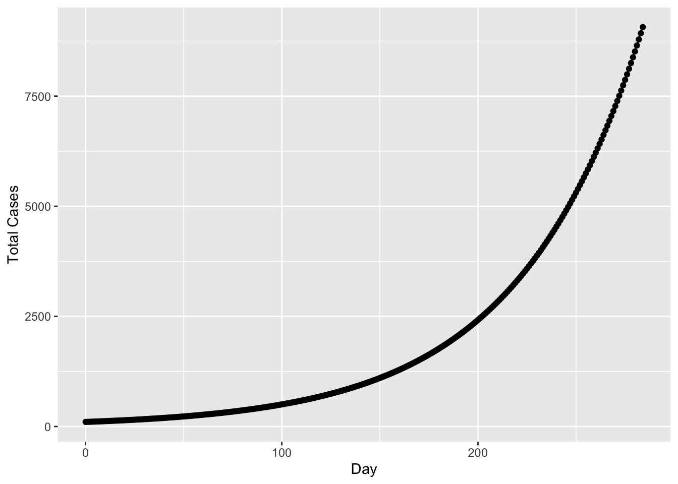
#assuming 4.6% increase weekly after vaccine for another 100 days
after_vac <- 285:385

# data for without vaccine
without_vac <- c(before_vac, after_vac)
cases_after <- round(104*(1.015857^without_vac), digits = 0)

# data with vaccine
case_vac.285to300 =
    round(cases[285]*(1.00657143^(1:101)), digits = 0)

# plot comparing hypothesized increase for before and after vaccine
  ggplot() +
    geom_line(aes(x = without_vac,
                  y = cases_after)) +
    geom_point(aes(x = before_vac,
                   y = cases)) +
    geom_line(aes(x = after_vac,
                  y = case_vac.285to300), col = "blue") +
    xlab("Day") +
    ylab("Total Cases")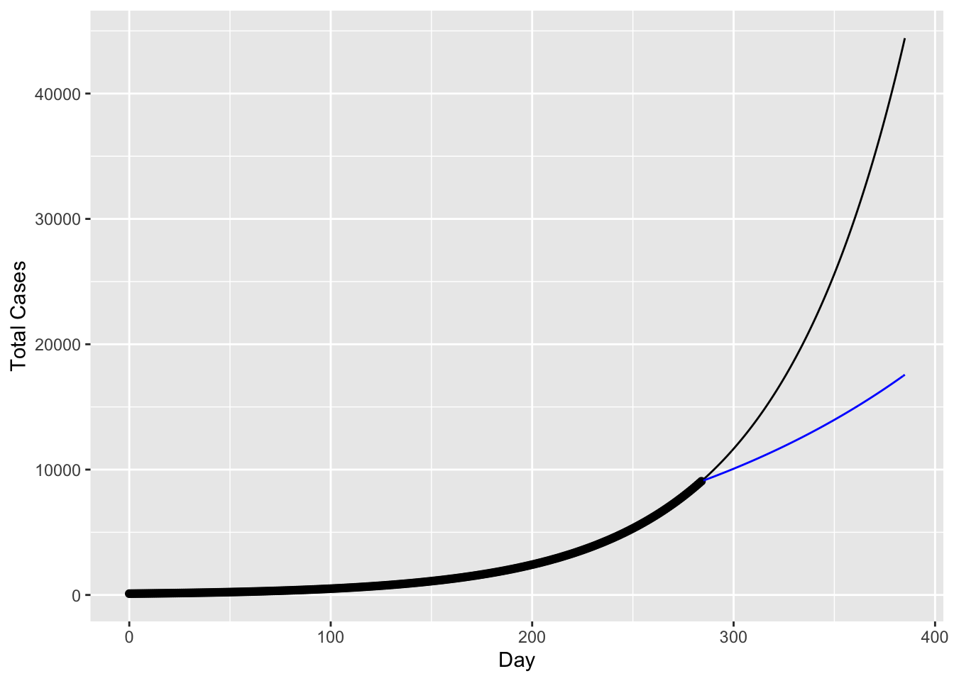
Apparently without any public health intervention, cases are hard to slow down, but does our hypothesized bending curve with vaccine available corresponding to the actual cases number? If it is very different, how long does vaccine take its effectiveness? How does the distribution of vaccine by sex, age, and race etc. demographic characteristics impact on the effectiveness of vaccine distribution and containing cases increment?
#case_vac.285to300

#[101] 17570

#cases_after

#[386] 44420
The actual new cases increases on 3.14.2021 after around 100 days of vaccine available is ~37989 recorded by the New York Times. The factual new cases is in between our hypothesized cases without 44420 and with vaccine 17570. We could possibly say that the early-stage effectiveness of vaccine is not as potent as later in the 2021 while the CDC recorded or there is a lag in vaccine effective but is there other reasons that can result in the extra increment in new cases. Now we want to examine the vaccine distribution by demographic characteristics and hesitancy.