Vaccination Rates
Vaccination Rate in the US
vacc_rate_df =
  GET("https://data.cdc.gov/resource/rh2h-3yt2.csv",
      query = list("$limit" = 45000)) %>%
  content() %>%
  janitor::clean_names() %>%
  mutate(date = as.factor(date),
         date = as.Date((date))) %>%
  select(date, location, series_complete_cumulative) %>%
  filter(location == "US") %>%
  group_by(date) %>%
  summarize(total = mean(series_complete_cumulative)) %>%
  mutate(perc = total / 333775983,
         perc = perc * 100)

vacc_rate_df %>%
  ggplot(aes(x = date, y = perc)) +
  geom_line() +
  labs(
    x = "Date",
    y = "Percent",
    title = "Vaccination Rate in US \n December 2020 - December 2021",
    caption = "Data Source: CDC") +
  theme(plot.title = element_text(hjust = 0.5),
        plot.caption = element_text(face = "italic"))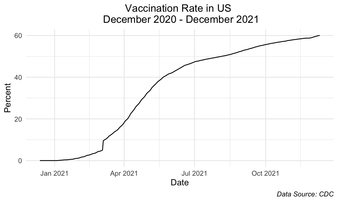
We see that the current vaccination rate of the United States as a whole is approximately 60%. The steepest slope is seen from mid-March to July 2021 which correlates to the time when the vaccines became accessible to the general public. After July 2021, there is still a meaningful increase but the slope has decreased as was expected.
Daily Vaccination Rate in US
daily_vaccination_df =
  GET("https://data.cdc.gov/resource/rh2h-3yt2.csv",
      query = list("$limit" = 45000)) %>%
  content() %>%
  janitor::clean_names() %>%
  mutate(date = as.factor(date),
         date = as.Date((date))) %>%
  select(date, administered_daily)

daily_vaccination_df %>%
  group_by(date) %>%
  summarize(total = sum(administered_daily)) %>%
  mutate(total = total / 333775983) %>%
  ggplot(aes(x = date, y = total)) +
  geom_line() +
  labs(
    x = "Date",
    y = "Percent",
    title = "Percentage of US Population Vaccinated Daily",
    caption = "Data Source: CDC") +
  theme(plot.title = element_text(hjust = 0.5),
        plot.caption = element_text(face = "italic"))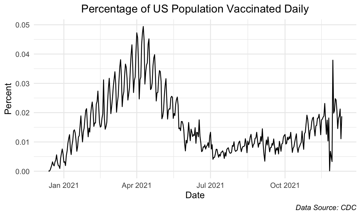
Accordingly, we can zoom in and see the trend on a daily vaccination level, which cooperates with our previous observations. As noted, we see an increase in daily vaccination rates until it hits a peak in April 2021, which then gradually decreases until July 2021. From then, we see that the daily rates are approximately constant.
Vaccination Rate by State over time
perc_vacc_df =
  read_csv(file = "./data/us_state_vaccinations.csv") %>%
  filter(!(location %in% c("Virgin Islands", "Veterans Health","Republic of Palau", "Puerto Rico",   "Northern Mariana Islands", "Marshall Islands", "Indian Health Svc", "Guam", "Federated States of Micronesia", "District of Columbia", "Dept of Defense", "Bureau of Prisons", "American Samoa",    "United States"))) %>%
  mutate(
     location = recode(location, "New York State" = "New York")) %>%
  select(location, date, people_fully_vaccinated_per_hundred)

code_df = read_csv(file = "./data/csvData.csv") %>%
  janitor::clean_names() %>%
  rename(location = state) %>%
  select(location, code)

map_code_df = merge(perc_vacc_df, code_df , by = "location") %>%
  mutate(hover = paste0(location, "\n", people_fully_vaccinated_per_hundred, "%"),
         date = as.factor(date)) %>%
  rename(Vaccination_Rate = people_fully_vaccinated_per_hundred)

fontstyle = list(
  family = "DM Sans",
  size = 15,
  color = "black")

label = list(
  bgcolor = "#EEEEEE",
  bordercolor = "transparent",
  font = fontstyle)

choropleth_map_vaccination =
  plot_geo(map_code_df,
          locationmode = "USA-states",
          frame = ~ date) %>%
  add_trace(locations = ~ code,
            z = ~ Vaccination_Rate,
            color = ~ Vaccination_Rate,
            text = ~ hover,
            hoverinfo = "text") %>%
  style(hoverlabel = label) %>%
  layout(geo = list(scope = "usa"),
         title = "Vaccination Rate in the United States") %>%
  colorbar(ticksuffix = "%")

choropleth_map_vaccination
Over time, the upper-east states, such as Maine, Connecticut, and Rhode Island, seem to be among the highest percent vaccinated states whereas the southern and mid-west states, such as Alabama, Mississippi, Wyoming, and Idaho seem to be among the lowest percent vaccinated states.
Vaccination Rates by Different Subgroups
Age Group
age_line_df =
  GET("https://data.cdc.gov/resource/gxj9-t96f.csv",
      query = list("$limit" = 10000)) %>%
  content() %>%
  janitor::clean_names() %>%
  mutate(
    cdc_case_earliest_dt = as.factor(cdc_case_earliest_dt),
    date = as.Date(cdc_case_earliest_dt),) %>%
  mutate(
    series_complete_pop_pct = 100 * series_complete_pop_pct)

age_line_df %>%
  ggplot(aes(x = date, y = series_complete_pop_pct, color = agegroupvacc)) +
  geom_line(aes(group = agegroupvacc)) +
  scale_x_date(date_labels = "%b %y", date_breaks  = "1 month") +
  labs(
    x = "Date",
    y = "Percent Vaccinated",
    title = "Trend of Vaccination Rate by Age Groups",
    caption = "Data Source: CDC",
    color = "Age Group") +
  theme(plot.title = element_text(hjust = 0.5),
        plot.caption = element_text(face = "italic"))
The older age groups reached their peak faster as was expected because they were given priority access. The trend across all age groups look very similar but delayed in accordance to decreasing age groups. However, one interesting thing to note is that the peaks reached by each age group seemingly gets lower as the age groups decrease, which was not something we expected to see.
Race/Ethnicity
race_line_df =
  GET("https://data.cdc.gov/resource/km4m-vcsb.csv",
      query = list("$limit" = 10000)) %>%
  content() %>%
  janitor::clean_names() %>%
  mutate(
    date = as.factor(date),
    date = as.Date(date),
    demographic_category = str_replace(demographic_category, "Race_eth_", "")
  ) %>%
  filter(
    demographic_category %in% c("NHBlack", "NHWhite", "Hispanic", "NHAIAN", "NHAsian", "NHNHOPI")) %>%
  mutate(
    demographic_category = recode(demographic_category, NHBlack = "Black",
    NHWhite = "White",
    NHAsian = "Asian",
    NHAIAN = "American Indian/Alaska Native",
    NHNHOPI = "Native Hawaiian/Other Pacific Islander")) %>%
  select(date, demographic_category, series_complete_pop_pct)

race_line_df %>%
  ggplot(aes(x = date, y = series_complete_pop_pct, color = demographic_category)) +
  geom_line(aes(group = demographic_category)) +
  scale_x_date(date_labels = "%b %y", date_breaks  = "1 month") +
  labs(
    x = "Date",
    y = "Percent Vaccinated",
    title = "Trend of Vaccination Rate by Race/Ethnicity",
    caption = "Data Source: CDC",
    color = "Race/Ethnicity") +
  theme(plot.title = element_text(hjust = 0.5),
        plot.caption = element_text(face = "italic"))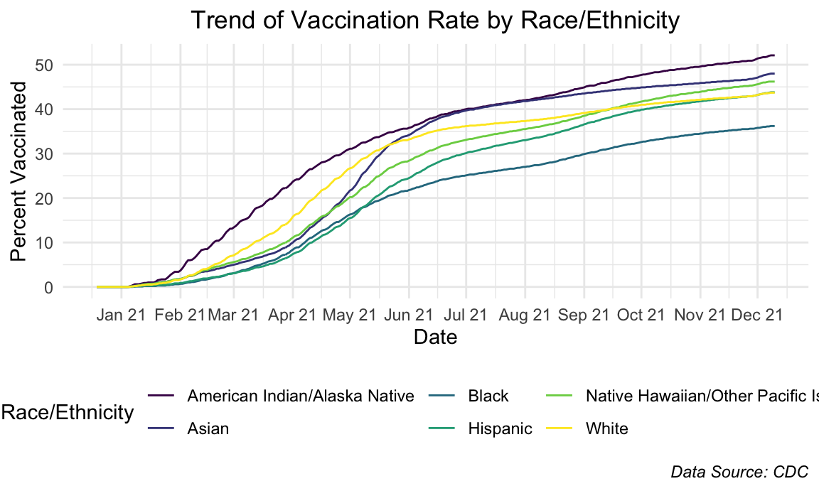
The trends of vaccination rate by race/ethnicity don’t show any striking differences with the exception of a small divergence in the beginning stages of American Indian/Alaskan Native.
Sex
sex_line_df =
  GET("https://data.cdc.gov/resource/km4m-vcsb.csv",
      query = list("$limit" = 10000)) %>%
  content() %>%
  janitor::clean_names() %>%
  mutate(date = as.factor(date),
         date = as.Date((date))) %>%
  filter(demographic_category %in% c("Sex_Male", "Sex_Female")) %>%
  mutate(
    demographic_category = str_replace(demographic_category, "Sex_", "")
  ) %>%
  select(date, demographic_category, series_complete_pop_pct)

sex_line_df %>%
  ggplot(aes(x = date, y = series_complete_pop_pct, color = demographic_category)) +
  geom_line(aes(group = demographic_category)) +
  scale_x_date(date_labels = "%b %y", date_breaks  = "1 month") +
  labs(
    x = "Date",
    y = "Percent Vaccinated",
    title = "Trend of Vaccination Rate by Sex",
    caption = "Data Source: CDC",
    color = "Sex") +
  theme(plot.title = element_text(hjust = 0.5),
        plot.caption = element_text(face = "italic"))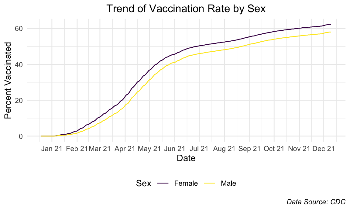
Females constantly stayed more vaccinated than male counterparts and the graphs show an almost-identical trend.
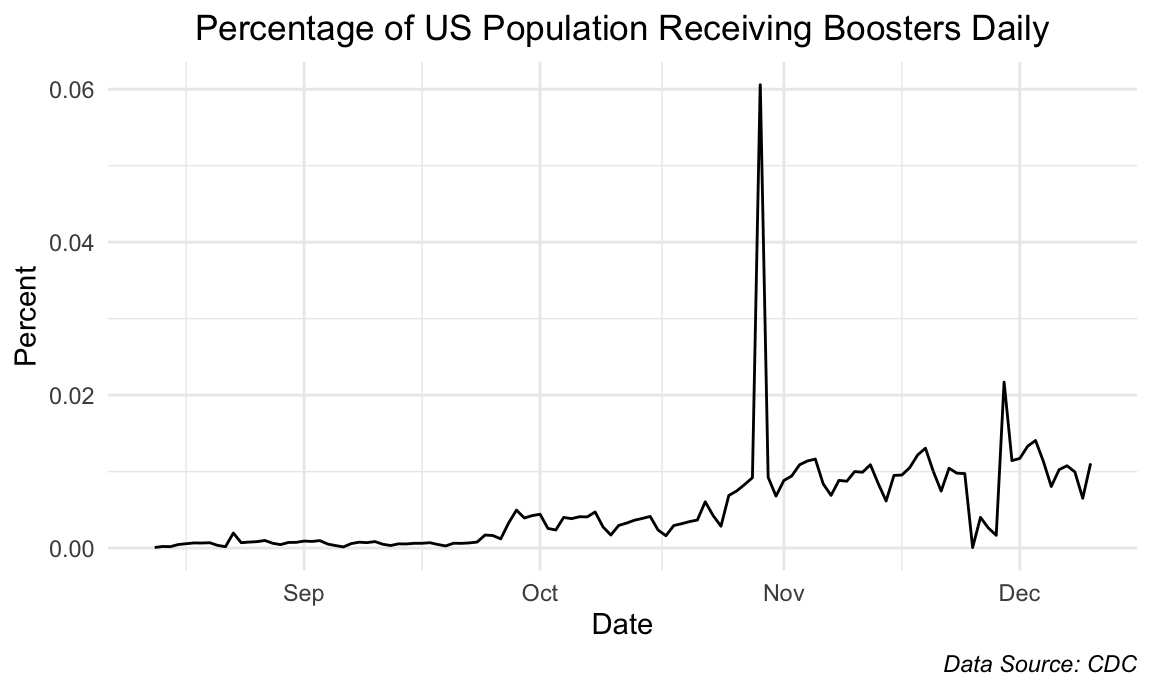
Daily Booster Administration
booster_df =
  GET("https://data.cdc.gov/resource/rh2h-3yt2.csv",
      query = list("$limit" = 45000)) %>%
  content() %>%
  janitor::clean_names() %>%
  mutate(date = as.factor(date),
         date = as.Date((date))) %>%
  filter(booster_daily != 0) %>%
  select(date, booster_daily)

booster_df %>%
  group_by(date) %>%
  summarize(total = sum(booster_daily)) %>%
  mutate(total = total / 333775983) %>%
  ggplot(aes(x = date, y = total)) +
  geom_line() +
  labs(
     x = "Date",
    y = "Percent",
    title = "Percentage of US Population Receiving Boosters Daily",
    caption = "Data Source: CDC") +
  theme(plot.title = element_text(hjust = 0.5),
        plot.caption = element_text(face = "italic"))